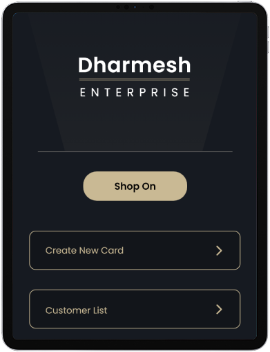
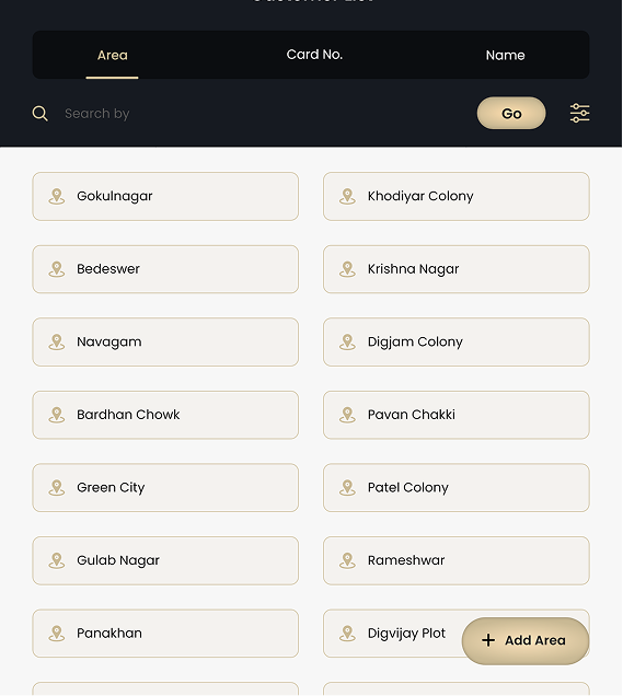
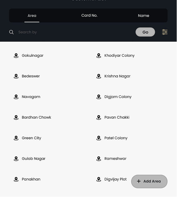
Dharmesh Enterprises is a next-generation business management application built to bring order to operational chaos. We designed an ecosystem that streamlines complex workflows, simplifies inventory management, and gives entrepreneurs total control over their data. By moving away from fragmented spreadsheets and offline systems, we created a unified digital tool that empowers modern businesses to grow with clarity and confidence.
Business Management |Productivity
2025
UI/UX Design | Product Strategy | Brand Identity | Visual Design


Visual Identity
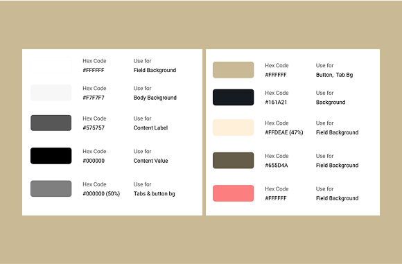
The color palette for Dharmesh Enterprise was designed to reflect the app’s core principles — efficiency, focus, and innovation. A deep blue primary tone communicates professionalism and reliability, while vibrant accents of yellow and turquoise bring energy and modernity to the interface. Neutral greys and soft whites create breathing space, allowing users to focus on data without distraction.
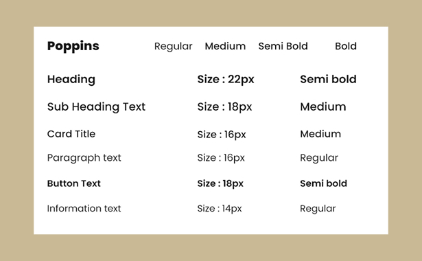
A deep blue primary tone communicates reliability and professionalism. Vibrant accents of yellow and turquoise bring energy to the interface, while neutral greys provide the breathing space needed for data-heavy screens.
We crafted a set of functional, streamlined icons representing management tasks, from data analytics to inventory tracking. These visuals reduce cognitive load, helping users identify tools at a glance.
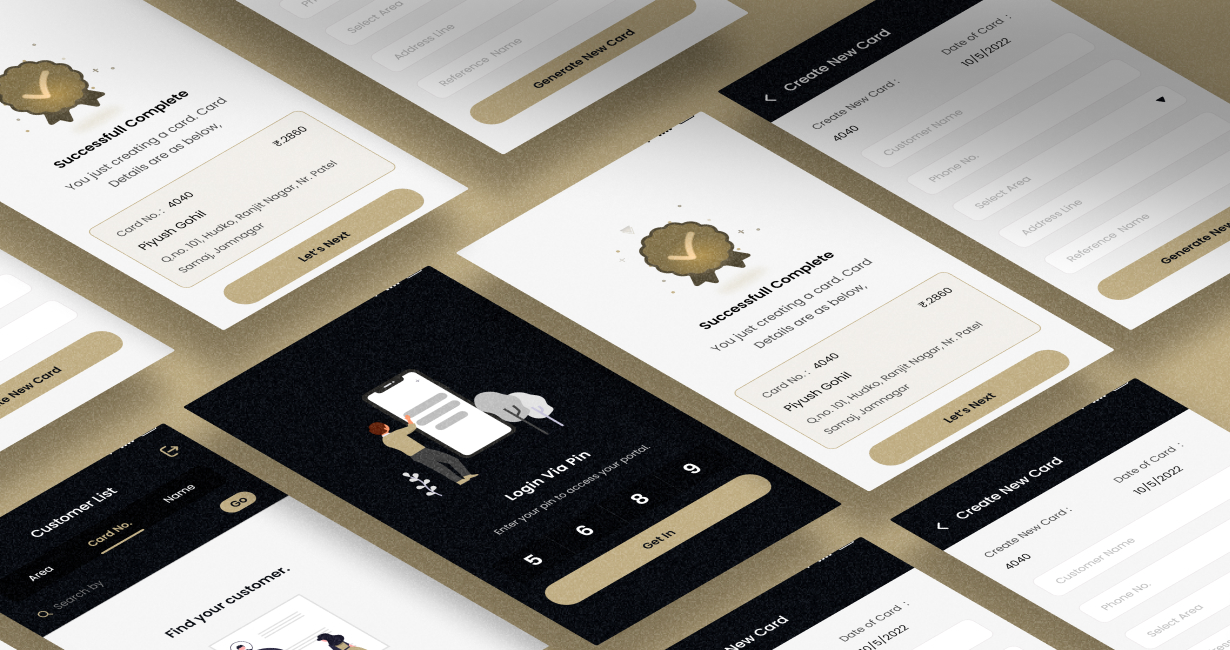
A visual system that turns numbers into narratives of trust. This scalable framework ensures that every dashboard and report feels consistent, professional, and easy to navigate.
Design System
Web UI
Mobile UI
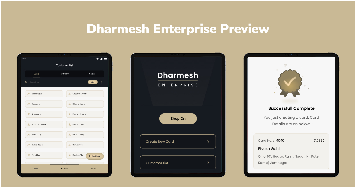

"Webx helped us transform a complex idea into a simple, powerful tool. The new interface has significantly improved our operational efficiency and how our users interact with their business data."


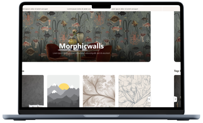
Redefining interiors with a bold digital gallery that brings creativity to life. The platform enables seamless exploration and customization of premium wallpapers for homes and businesses.
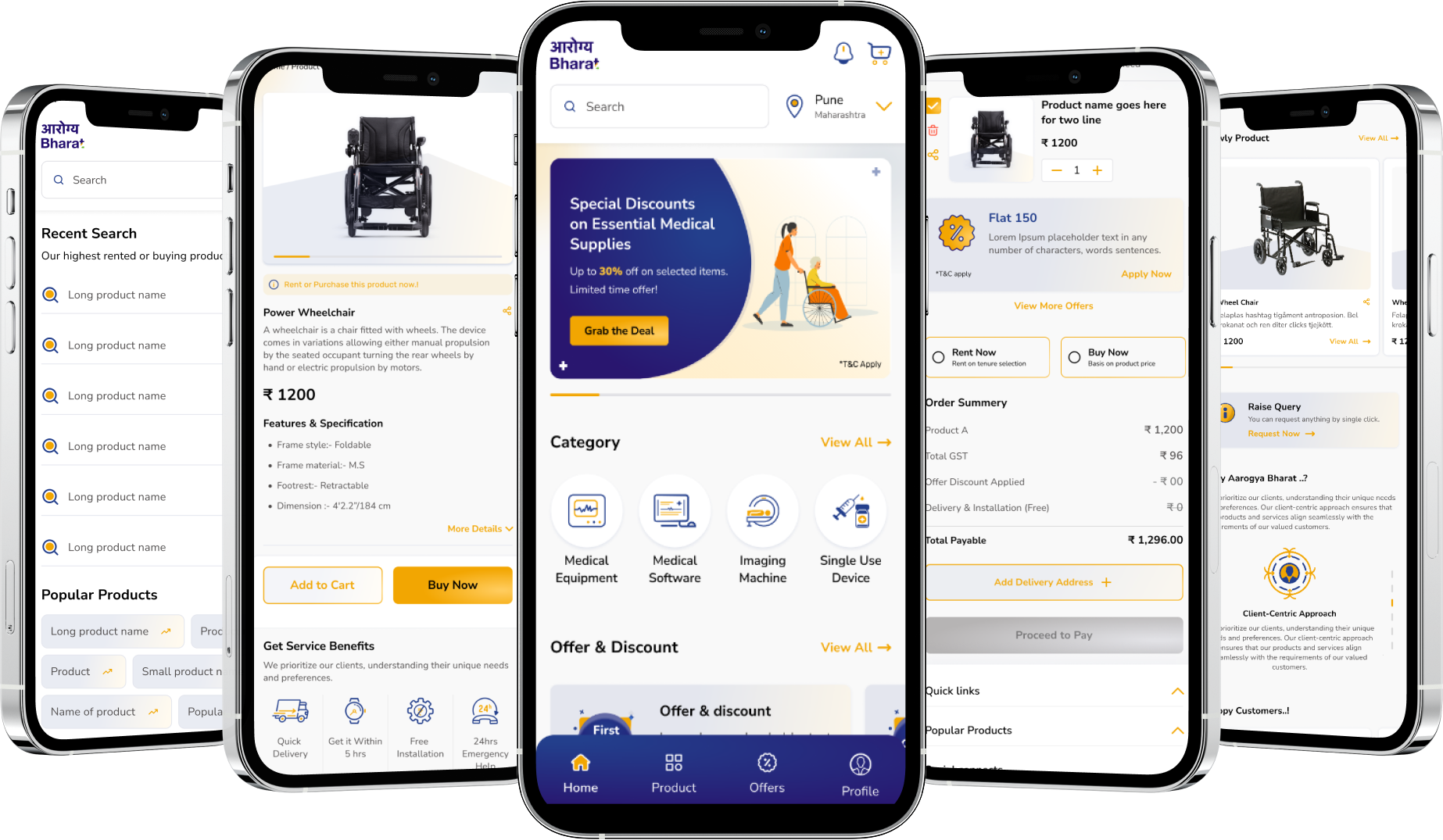
Simplifying healthcare navigation through clear, accessible, and user-first digital journeys. This professional platform bridges the gap between complex medical instruments and intuitive usability.
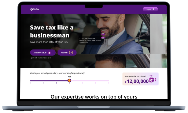
A clean fintech interface designed to turn complex tax processes into smooth digital experiences. This strategic approach successfully boosted user conversion rates by over 200%.
Transforming the strength of brass manufacturing into a sophisticated global brand identity. This visual narrative highlights engineering excellence and precision for the international export market.

A visual identity rooted in geometric accuracy and industrial strength for high-precision manufacturing. The design system unifies a diverse parts catalog under one professional, global brand.

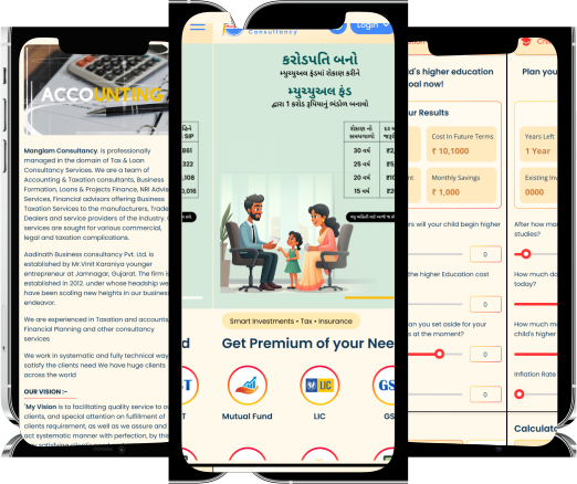
Reimagining financial consultancy with a modern identity that symbolizes stability and growth. Reorganized messaging makes complex taxation and loan services accessible and trustworthy for every client.