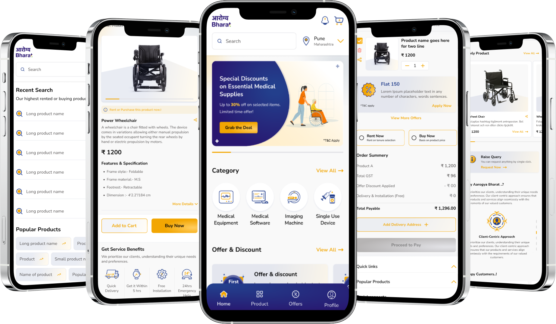
Arogya Bharat is a leading provider of professional healthcare instruments, from Spirometer machines to pediatric mobility solutions. We transformed their digital storefront into a high-performance platform that reflects their commitment to excellence. By simplifying complex medical data and purchasing paths, we created a reliable bridge between advanced technology and the healthcare professionals who need it.
Medical Industries
2024
Branding | UI UX Design | Social Media


Visual Identity
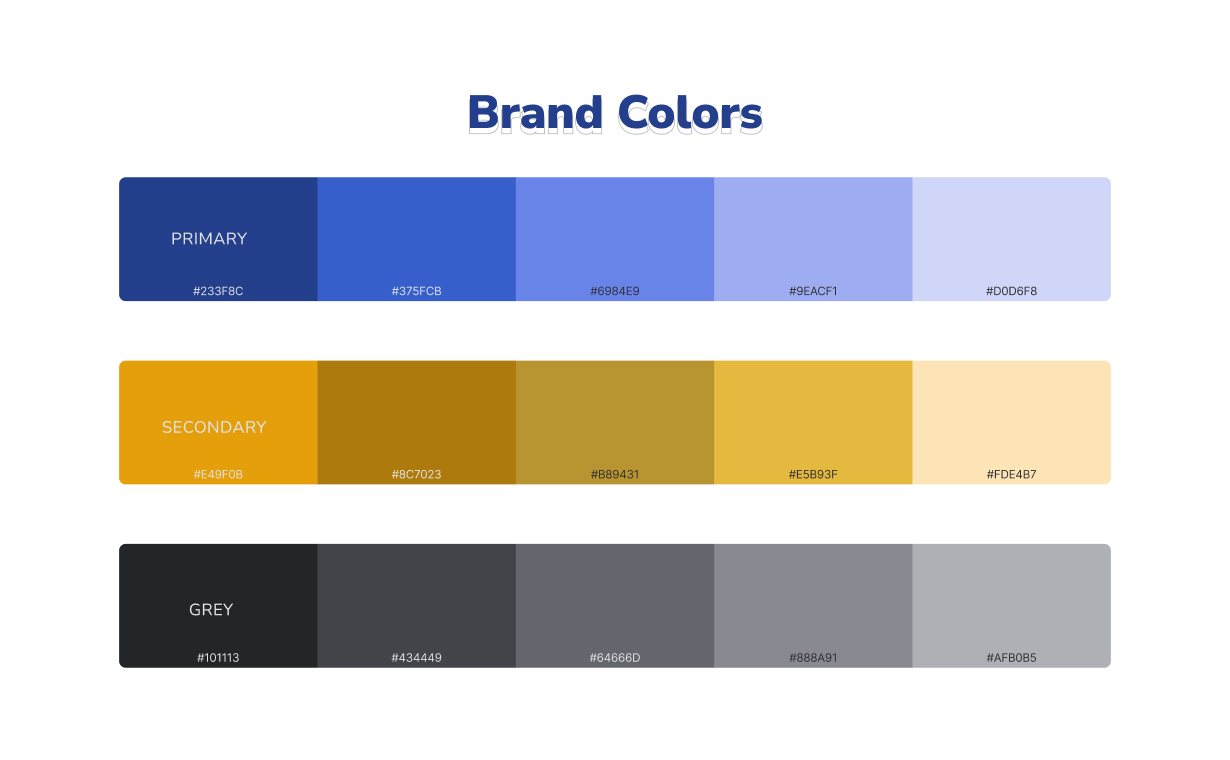
Deep blues convey reliability and professionalism, while vibrant oranges represent vitality and healthcare progress. Softer tones create a sense of balance and patient comfort.
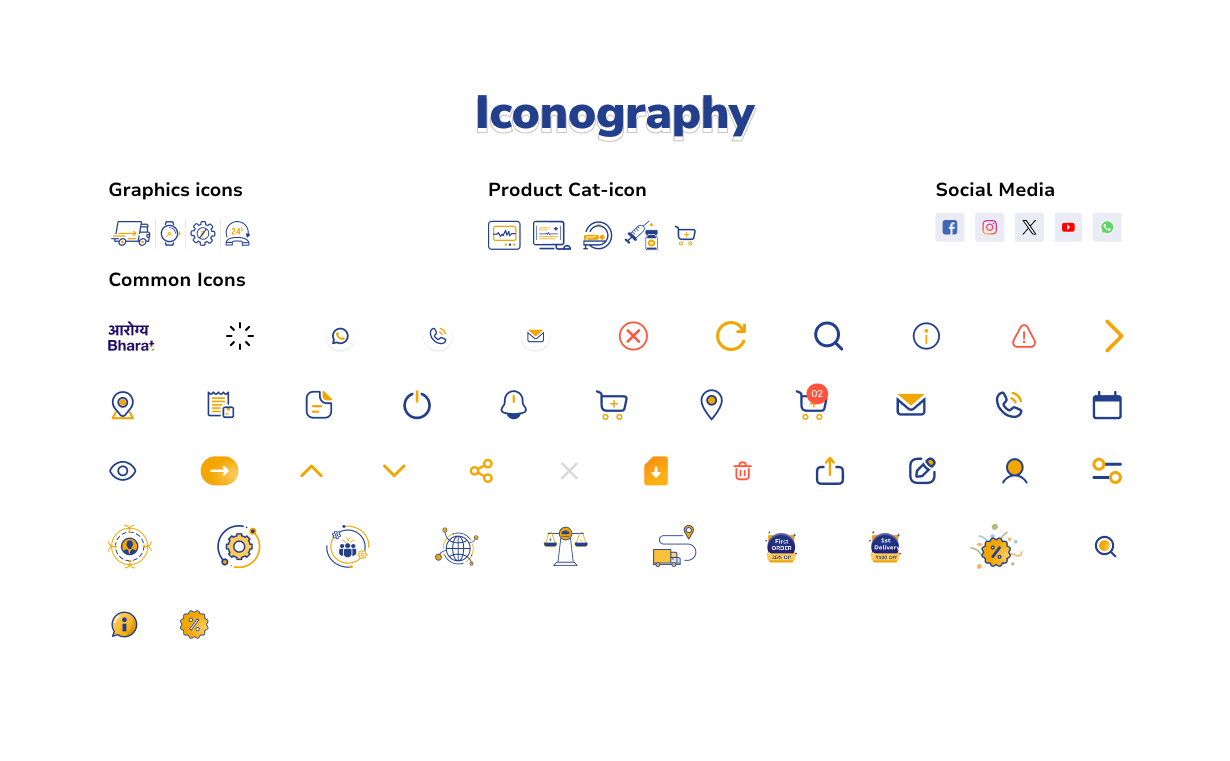
We developed a custom set of clean, medical-grade icons. Every symbol is designed to provide instant recognition of complex equipment categories.
At Arogya Bharat, the colour scheme was designed to embody our values of trust, care, and innovation. Deep blues convey professionalism and reliability, while vibrant oranges represent vitality and progress in healthcare. Softer shades were added to create harmony, balance, and a sense of comfort across all touchpoints of the brand.
We followed Arogya Bharat brand guidelines for the colour scheme, which conveyed a sense of professionalism and trustworthiness. Bold blues and deep oranges from the brand's palette were used to create a strong visual impact, while lighter shades added balance and harmony.
Design System
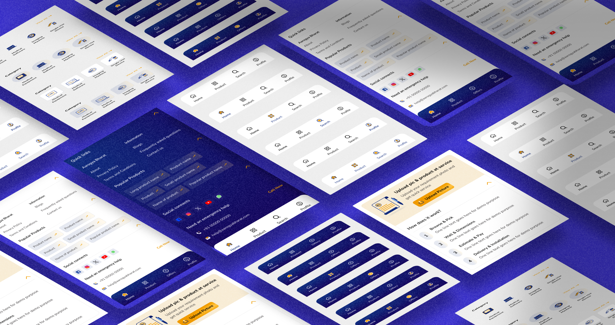
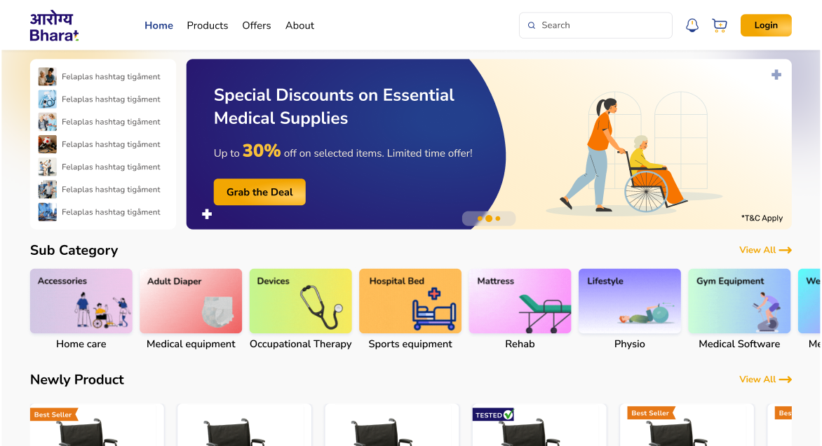
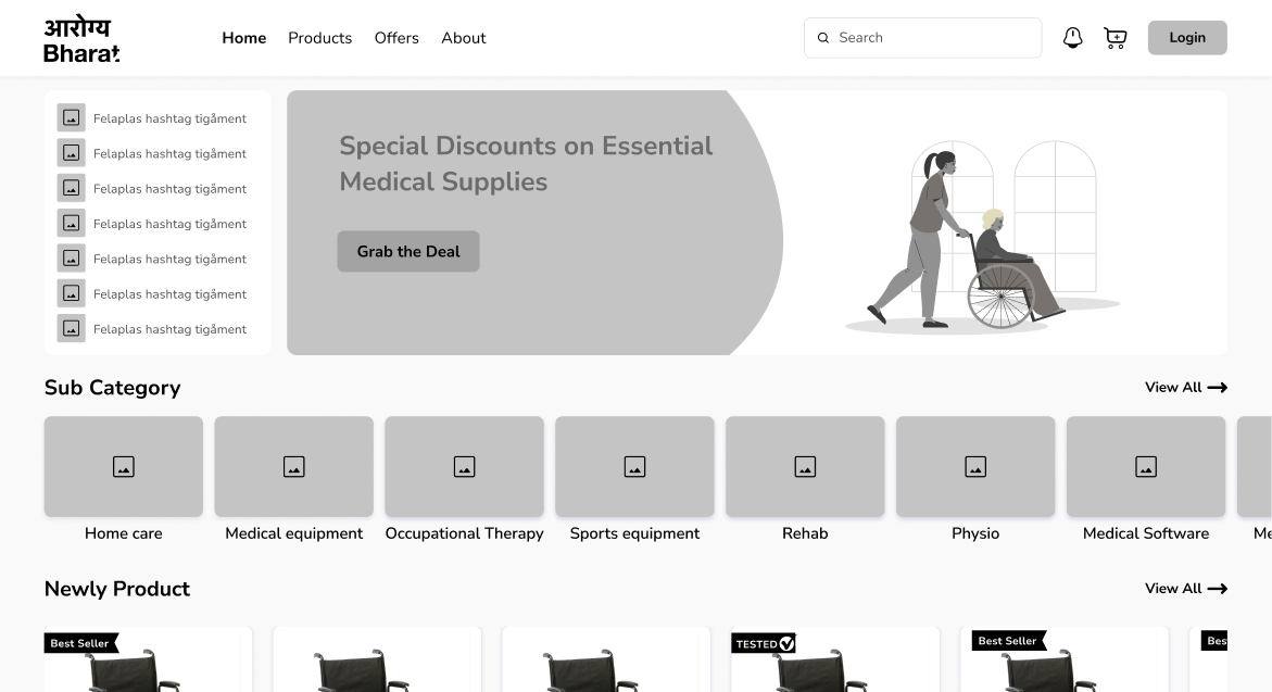
Web UI
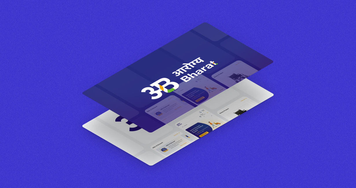
Mobile UI
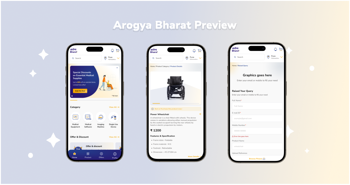

"Webx stands out for its ability to combine healthcare expertise with design innovation. Their collaborative mindset and professional approach resulted in solutions that exceeded our expectations."


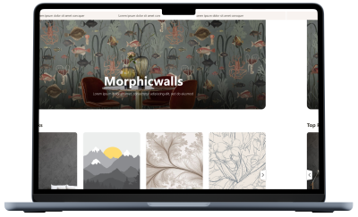
Redefining interiors with a bold digital gallery that brings creativity to life. The platform enables seamless exploration and customization of premium wallpapers for homes and businesses.
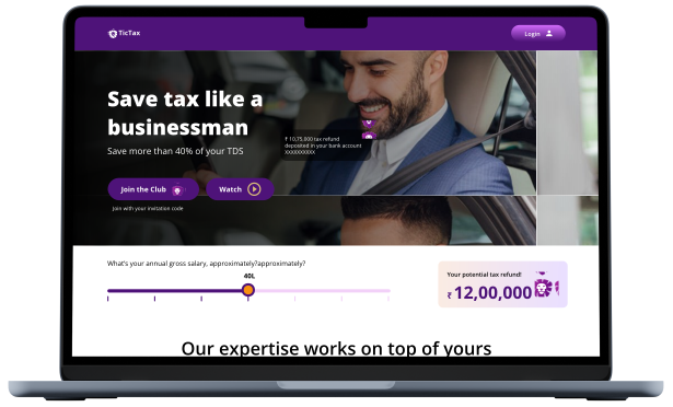
A clean fintech interface designed to turn complex tax processes into smooth digital experiences. This strategic approach successfully boosted user conversion rates by over 200%.
Transforming the strength of brass manufacturing into a sophisticated global brand identity. This visual narrative highlights engineering excellence and precision for the international export market.

A visual identity rooted in geometric accuracy and industrial strength for high-precision manufacturing. The design system unifies a diverse parts catalog under one professional, global brand.
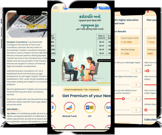
Reimagining financial consultancy with a modern identity that symbolizes stability and growth. Reorganized messaging makes complex taxation and loan services accessible and trustworthy for every client.
A unified management application designed to streamline fragmented workflows and operational chaos. The result is a simple, powerful tool that provides entrepreneurs with total clarity and control.