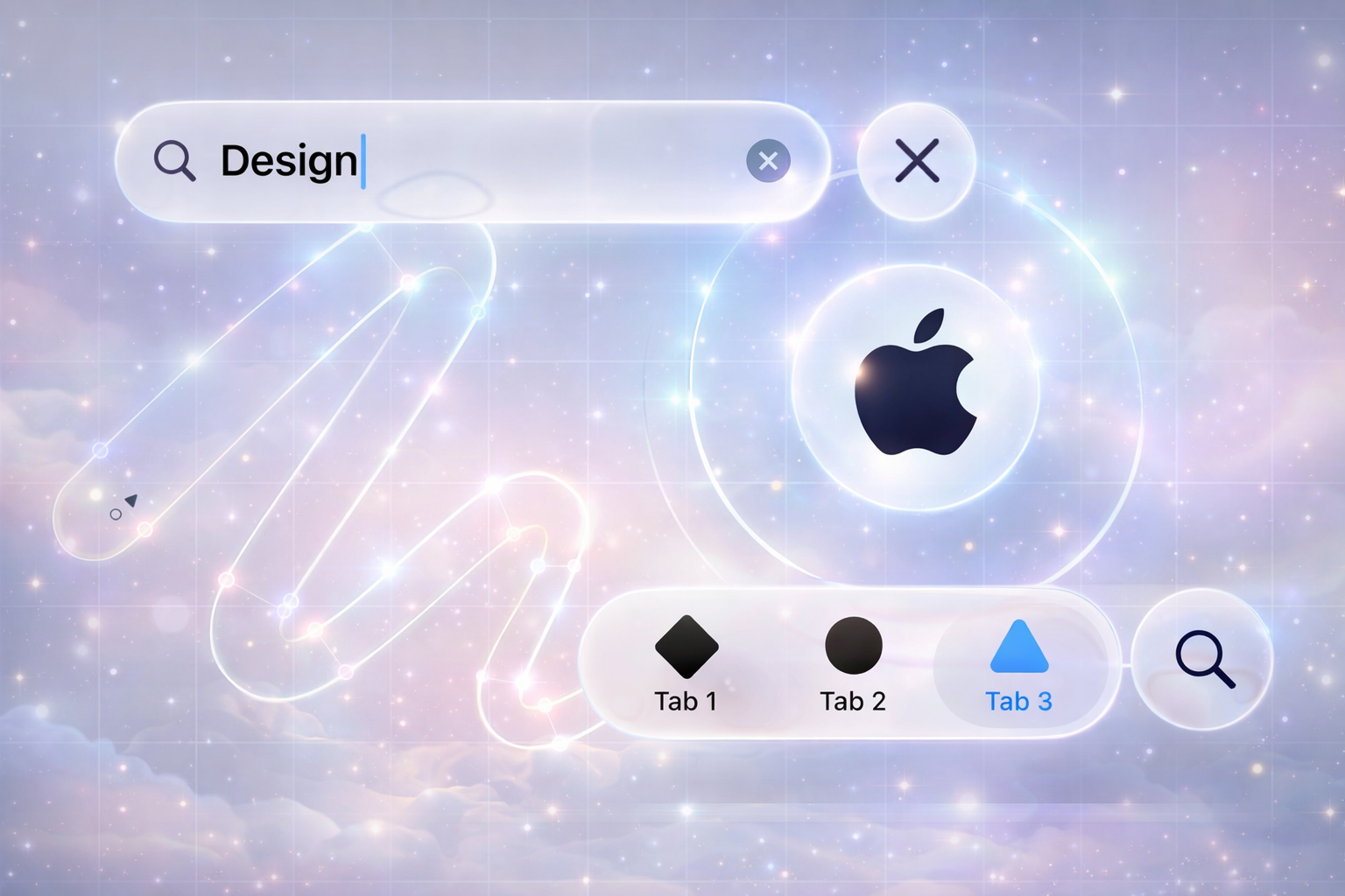
Apple is not just a tech company; it is a masterclass in product design and user experience. From the first iPhone to the latest visionOS interfaces, Apple has consistently set the bar for how digital products should look, feel, and behave.
For UX/UI designers, founders, and product teams, studying Apple's design language is like getting a free design school. The goal is not to copy Apple pixel‑by‑pixel, but to understand the principles behind their decisions and apply those lessons to your own brand.
This article breaks down key patterns from Apple's design approach and turns them into 10 practical UX lessons your business can use in 2026.
1. Start with Clarity, Then Add Delight
Apple products rarely feel confusing. Whether it is the Settings app on iOS or the interface of the Apple Watch, the primary action on each screen is usually obvious.
What Apple does:
- One clear primary action per screen
- Simple, familiar labels instead of jargon
- Hidden complexity – advanced settings are available, but tucked away
What you can apply:
- On each screen, ask: "If the user does only one thing here, what should it be?"
- Make that primary action visually dominant (button style, size, position)
- Move secondary actions into menus, ellipsis buttons, or secondary areas
Clarity reduces cognitive load and makes interfaces feel "effortless," which is exactly how Apple positions its products.
2. Obsess Over Typography and Spacing
Apple's interfaces look clean largely because of typography and spacing, not just color or icons. The use of San Francisco font, consistent line heights, and generous white space makes content readable and premium.
What Apple does:
- Clear hierarchy using font weight and size (title, subtitle, body, caption)
- Generous padding around sections and components
- Plenty of breathing room between blocks of content
What you can apply:
- Define a simple type scale: e.g., H1, H2, H3, Body, Caption and stick to it
- Avoid mixing too many fonts or random sizes
- Increase line spacing slightly and add more white space than you think—especially for headings and sections
Good typography instantly makes your product feel more "designed," even if the layout is simple.
3. Design for the Entire Journey, Not Just Screens
Apple never thinks in terms of isolated screens; it thinks in journeys. From unboxing a device to the onboarding animations and default apps, the experience feels continuous.
What Apple does:
- Seamless transitions between states (lock screen → home → app)
- Consistent gestures and patterns across apps
- Onboarding flows that blend into normal usage (e.g., tips appearing contextually)
What you can apply:
- Map out end‑to‑end user journeys: discovery, onboarding, first success, regular use, support
- Design key transitions (e.g., after signup, after first purchase, after error) with intention
- Keep patterns consistent across your website/app so users do not "re‑learn" every time
Thinking in journeys instead of pages leads to more coherent, trustworthy products.
4. Use Motion to Explain, Not Just to Impress
Apple's animations feel smooth and meaningful. When a user opens an app, taps a card, or swipes back, the motion helps the brain understand where things come from and where they go.
What Apple does:
- Subtle zoom and slide animations that follow user actions
- Consistent transition patterns across the OS
- Physics‑inspired motion (ease in/out, momentum, resistance)
What you can apply:
- Use micro‑animations to show cause and effect (button press, card expansion, success state)
- Avoid gimmicky or random animations that do not support understanding
- Keep durations short (generally 150–250ms) so the UI feels snappy, not slow
Thoughtful motion reinforces the mental model of your interface and makes interactions feel "real."
5. Build Strong Visual Hierarchy with Simple Components
Apple's UIs are visually rich but made from simple, reusable components: cards, lists, tabs, bottom bars, and toolbars.
What Apple does:
- Clear primary area (content), secondary area (navigation), and supporting area (toolbars, filters)
- Recycles component patterns across apps (Lists, Cells, Modals, Sheets)
- Uses color sparingly to highlight important actions
What you can apply:
- Define a small design system of reusable components: buttons, cards, list items, tags, modals
- Apply them consistently instead of re‑inventing styles on every page
- Use color and elevation (shadows, borders) to draw attention to key elements, not everything
A small, well‑defined system scales better and keeps products cohesive, especially as they grow.
6. Prioritize Thumb‑Friendly, Real‑World Usage
Apple devices are designed for real hands, pockets, and environments. That thinking continues in their UI decisions—especially on iOS.
What Apple does:
- Places important controls at the bottom on larger phones (Tab Bars, Bottom Sheets)
- Uses large touch targets that are easy to tap on the move
- Simplifies forms and inputs for mobile usage
What you can apply:
- Place primary actions where thumbs naturally reach (bottom area on mobile)
- Make tap targets at least 44px high/wide
- Avoid long forms; split them into steps or use smart defaults
Designing for real‑world use makes your product feel thoughtful and polished, especially on mobile.
7. Craft a Consistent Visual Language Across Platforms
Apple's ecosystem—iPhone, iPad, Mac, Watch, TV—feels like a family. Each device has its own UI adaptations, but the core language is shared.
What Apple does:
- Shared design language (SF typeface, rounded corners, blur, depth)
- Platform‑specific optimizations (hover states on Mac, compact layouts on Watch)
- Iconography and tone of voice that feel cohesive
What you can apply:
- Define your brand's core visual language: colors, typography, shapes, icon style, tone of copy
- Adapt layouts per platform (web, mobile, tablet) without changing the brand feel
- Use a single design system file (Figma/Sketch) as the source of truth
This consistency helps users instantly recognize your brand, wherever they see it.
8. Make Empty States and Edge Cases Feel Designed
In many products, error messages and empty states feel like afterthoughts. Apple often treats them as key parts of the experience.
What Apple does:
- Friendly, clear error messages explaining what went wrong and how to fix it
- Thoughtful empty states that guide users toward the next step
- Offline/low‑battery states that still feel like part of the brand
What you can apply:
- Design empty states with helpful copy and clear calls‑to‑action
- Avoid generic errors like "Something went wrong." Be specific when possible
- Consider low‑data, offline, or edge scenarios as part of your UX, not just technical exceptions
Well‑designed edge cases make products feel robust and reliable.
9. Use Copy as Part of the Interface, Not an Afterthought
Apple's microcopy—labels, descriptions, notifications—is short, human, and purposeful. The words are as carefully chosen as the visuals.
What Apple does:
- Uses simple, friendly language instead of technical slang
- Focuses on benefits and clarity ("Sign in to keep your data in sync") rather than features only
- Maintains a consistent tone across settings, alerts, and marketing surfaces
What you can apply:
- Collaborate early with a UX writer or treat copy as a design element
- Use short, active sentences and concrete labels (e.g., "Save Changes", "Start Free Trial")
- Match tone to your brand: calm, confident, helpful—never robotic or confusing
Strong microcopy often separates amateur products from professional ones.
10. Simplify Relentlessly—But Not at the Cost of Power
Apple products feel simple on the surface, yet are powerful underneath. The trick is not removing capabilities, but progressively revealing them.
What Apple does:
- Keeps the default experience simple for most users
- Hides advanced options behind "More" panels, nested settings, or long‑press gestures
- Regularly removes outdated features or complexity over product generations
What you can apply:
- Identify your core use cases and optimize the main UX around them
- Tuck advanced features into expandable sections, settings pages, or expert modes
- Review your product regularly and remove what is no longer needed
Simplicity is a strategic choice, not a lack of functionality.
Actionable Checklist: Applying Apple's UX Lessons
You can use this quick checklist with your team or clients:
- Is the primary action on each key screen completely clear?
- Is typography consistent and spacing generous enough?
- Have you mapped and designed full user journeys, not just individual screens?
- Do animations support understanding, or are they just decoration?
- Are you using a small, consistent component library everywhere?
- Are mobile interactions truly thumb‑friendly?
- Does the visual language stay consistent across all platforms?
- Are empty states and error messages clearly designed?
- Is the microcopy clear, human, and on‑brand?
- Is there a plan to simplify the product without removing power users' needs?
Final Thoughts: Learn from Apple, Don't Clone It
Studying Apple's design language is incredibly valuable—but cloning it blindly is not. Your brand, audience, and product context are different. The real opportunity is to:
- Understand why certain patterns work for Apple
- Translate those principles into your own visual language and UX decisions
- Build experiences that feel equally thoughtful and premium—on your own terms
At Webx Design Studio, we help brands apply world‑class UX principles—like those used by Apple—to their own products. Want a custom UX audit or design revamp? Contact us and let's study your product like a top‑tier case study.