

2026 is not about making every interface look futuristic. It is about making digital products feel more useful, more understandable, and more considerate of the context a person is in.
The strongest UI/UX work this year blends quiet visual confidence with smarter behaviour: interfaces adapt without becoming unpredictable, AI helps without taking over, and accessibility is designed into the system instead of added at the end.
What Has Changed in UI/UX for 2026?
The move is from static screens to responsive experiences. People expect products to remember context, reduce repeated work, and explain complex choices in plain language. At the same time, they are more alert to privacy, automation mistakes, and distracting visual noise.
That creates a new standard: useful intelligence, clear control, and design systems strong enough to flex without breaking brand trust.
1. Adaptive Interfaces That Respect Context
An adaptive interface changes what it shows or how it guides a person based on useful signals: whether they are new or returning, using a small screen, working quickly, or trying to complete a complex task. The goal is not to create a different product for every person. It is to remove unnecessary steps.
- Show a focused first-time path, then reveal shortcuts for confident users.
- Bring recent work, saved preferences, and likely next actions closer to the surface.
- Adjust density and guidance for screen size, input method, and user preference.
- Keep the core structure predictable so people never feel lost.
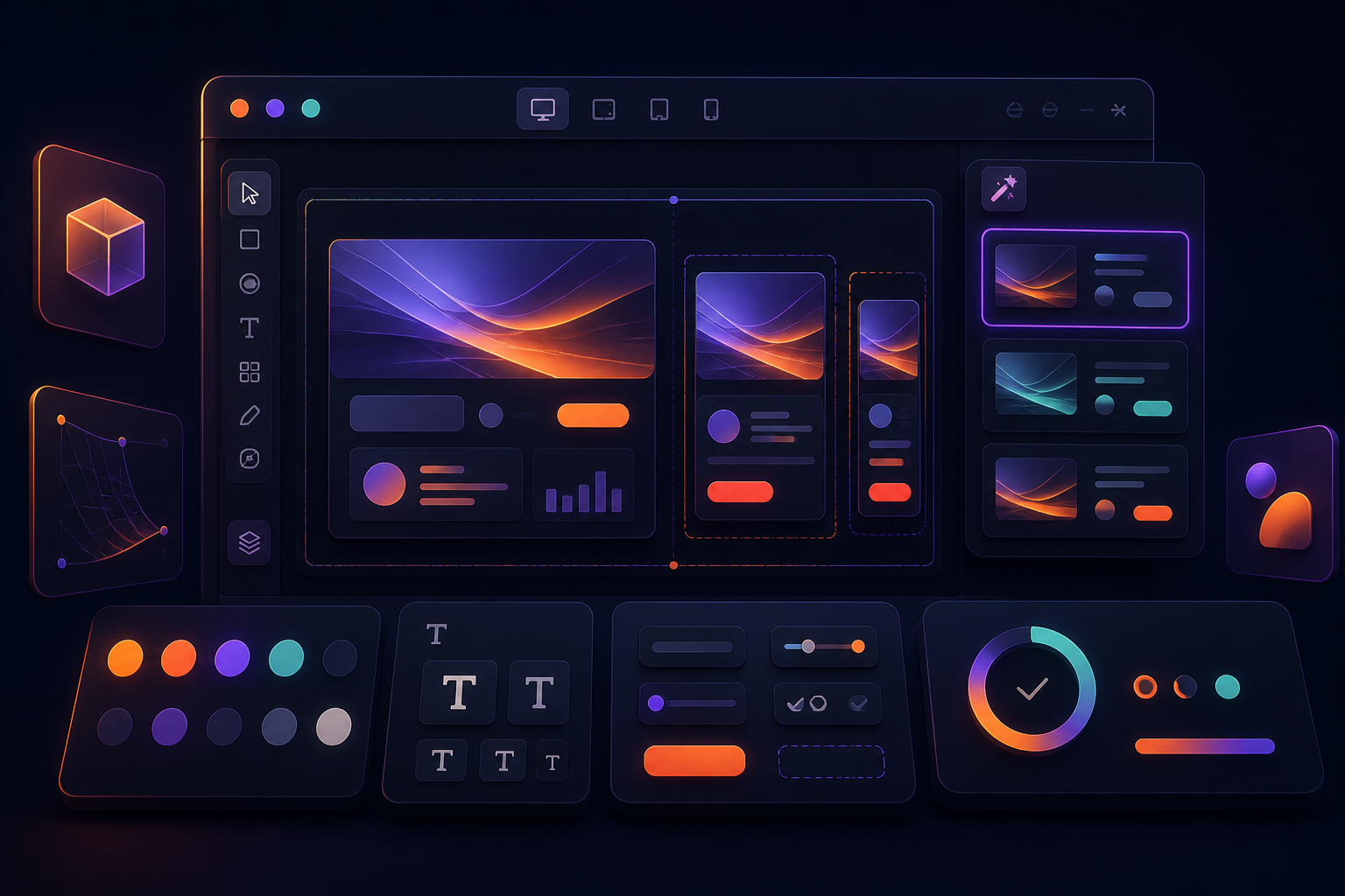
2. Agentic UX: Designing for AI That Can Take Action
AI is moving beyond chat windows. In many products, it can now prepare a draft, compare options, organise information, or complete multi-step work. This is often called agentic UX—but the important part is the experience around the action, not the label.
Good agentic interfaces make the AI's scope visible. Users should understand what the system will do, what data it is using, what is still waiting for approval, and how to undo a result. A helpful pattern is suggest → preview → confirm → review. It protects trust while preserving speed.
3. Calm, Editorial Visual Systems
After years of loud gradients, dense cards, and attention-grabbing motion, a calmer visual direction is gaining ground. Think generous spacing, rich but restrained colour, clear typography, and one strong focal moment instead of five competing ones.
This is not minimalism for its own sake. It is a way to make products easier to scan, more premium, and less mentally tiring—especially when people spend long stretches inside a dashboard or app.
- Use colour to establish hierarchy, status, and moments of delight—not to decorate every component.
- Build type scales that remain legible at smaller sizes and higher zoom levels.
- Let content containers breathe; dense screens need deliberate rhythm.
- Use texture, depth, or illustration only when it reinforces the task.
4. Accessible by Default, Not as a Final QA Step
Accessibility is becoming a design-quality signal, not a compliance checkbox. Teams are treating contrast, keyboard use, readable type, captions, reduced motion, and clear focus states as core product requirements from the beginning.
The upside is broader than accessibility alone. Clear labels help everyone. A visible focus state helps keyboard users and power users. Reduced motion makes an experience calmer. Better contrast works in bright sunlight as well as for people with low vision.
5. Multimodal Experiences Become Normal
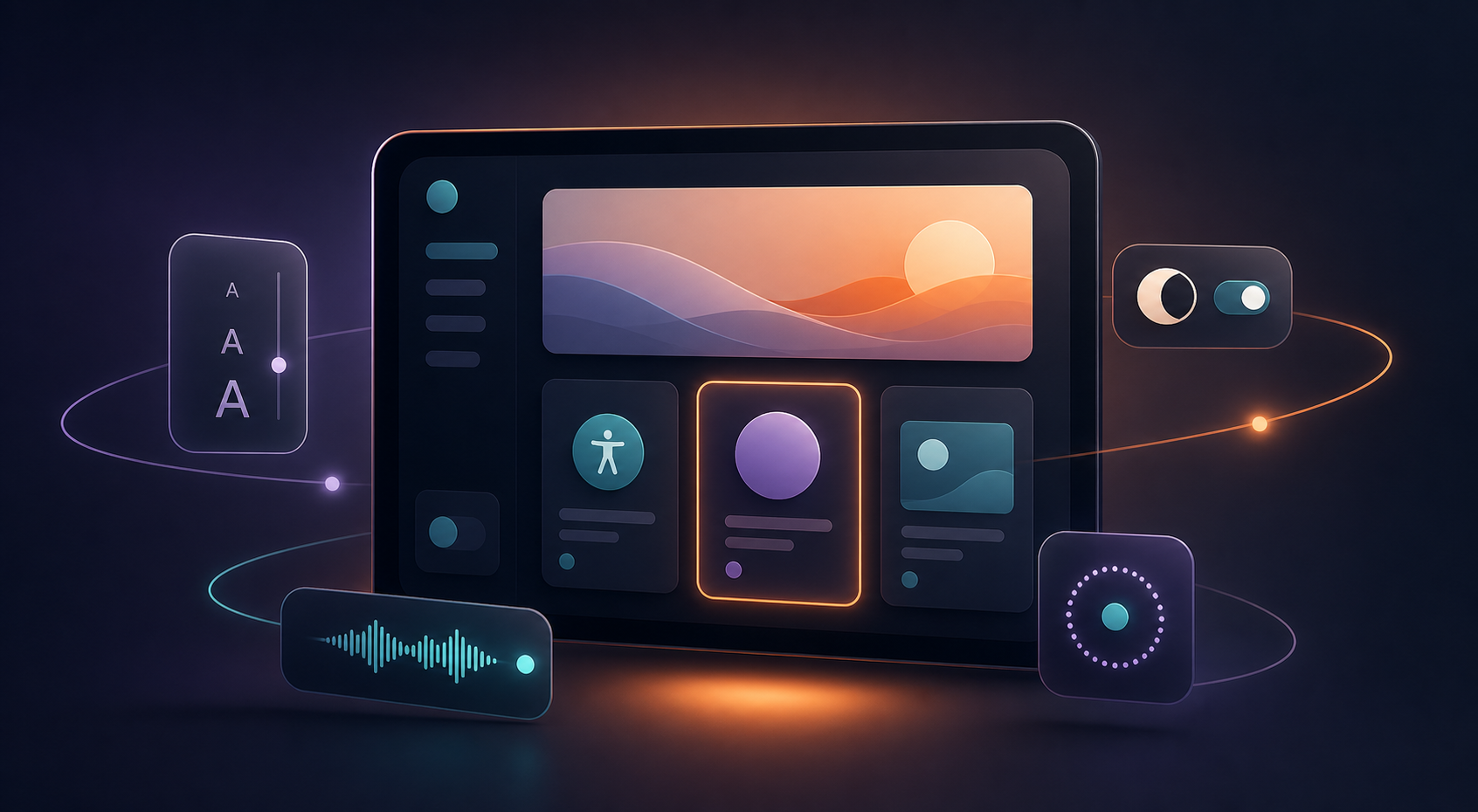
People do not always want to type. They may want to scan a document, speak a request, upload a photo, or switch between touch and keyboard. Multimodal UX connects these inputs in a single, forgiving flow.
The key is continuity. If someone starts with voice, they should be able to edit the result with text. If they upload an image, explain what was recognised and offer corrections. Every mode should leave a clear trail of what the product understood.
6. Purposeful Motion and Meaningful Feedback
Motion still matters, but the best motion now acts like feedback: it explains a state change, preserves a person's sense of place, or makes a waiting moment feel less uncertain. It should not slow down a frequent task or compete with content.
- Use transitions to show where a panel came from and where it went.
- Show progress for background tasks, especially AI-assisted work.
- Provide a reduced-motion option and avoid looping decorative animation.
- Make success, error, and saved states specific enough to be useful.
7. Design Systems That Can Flex
A design system in 2026 is more than a component library. It is a set of rules that lets a team scale a product across themes, locales, screen sizes, content states, and levels of personalisation.
The most valuable systems define the non-negotiables—voice, accessibility, spacing, interaction patterns, and content hierarchy—then give product teams safe room to adapt. Tokens, component variants, documented content rules, and regular design-engineering reviews make that possible.
A Practical Way to Use These Trends
You do not need a complete redesign to benefit from 2026's UI/UX direction. Start with the journey where customers hesitate, abandon, or ask for help most often.
- Choose one user outcome, such as completing onboarding or finding the right plan.
- Map the friction: repeated inputs, unclear decisions, slow feedback, or inaccessible controls.
- Prototype one targeted improvement rather than a visual overhaul.
- Test it with real users, including people who use different devices and assistive technology.
- Measure task completion, confidence, errors, and support demand—not only clicks.
What to Avoid
Trends are useful when they help a real user goal. They become expensive when they are copied without a reason. Avoid AI that creates extra review work, visual effects that obscure information, personalisation that feels invasive, or new interactions that require people to relearn simple tasks.
The best question to ask is simple: does this reduce effort while keeping the person in control? If the answer is yes, the trend is probably worth exploring.
Final Thoughts
The most enduring UI/UX trend for 2026 is thoughtful restraint. Products will become smarter, more adaptive, and more visual—but the winners will make that sophistication feel clear and human. Build for confidence, choice, and momentum, and your interface will age far better than any short-lived aesthetic.