

A color choice can make a button easier to find, a warning harder to miss, or a screen feel unexpectedly calm. But color does not carry a fixed message on its own. Its meaning is shaped by the task, the surrounding interface, the person using it, and what they have learned to expect.
That makes color a product decision, not merely a branding flourish. Used deliberately, it helps people scan, compare, understand status, and act with confidence. Used carelessly, it can add noise, imply the wrong thing, or make important information inaccessible.
This guide moves from color psychology to practical interface decisions: how to research associations, build a semantic color system, design accessible states, and test whether the palette is helping people complete real tasks.
What Color Psychology Can and Cannot Tell You
Color psychology studies how color may influence perception, emotion, attention, and behavior. It gives teams useful questions to explore: Does this accent make the primary action stand out? Does a success state feel reassuring? Does an alert create urgency that the situation does not deserve?
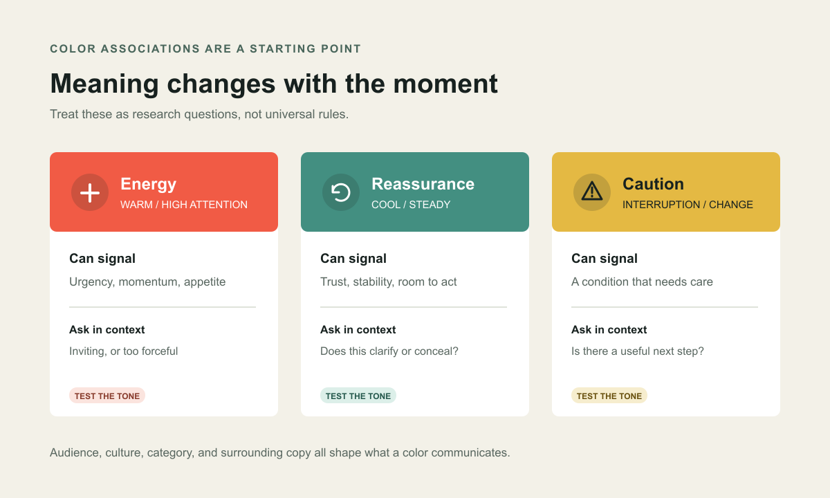
It cannot provide a universal lookup table where red always means danger, blue always means trust, or green always means success. Associations shift with culture, experience, industry, lighting, combinations, and the words beside them. A saturated red can mean a destructive action in one product and a familiar brand cue in another.
Treat an association as a hypothesis, then test it in the interface with the people who use it. The goal is not to make everyone feel the same emotion. It is to make the intended information easier to recognize without creating a misleading signal.
How People Perceive Color in an Interface
People rarely interpret an interface color in isolation. They see it against nearby surfaces, beside labels and icons, within a hierarchy, and in the context of a task. A warm accent used sparingly on a neutral page may signal the primary action; repeat it on every card, badge, and button and it loses its ability to prioritize.
- Contrast directs attention: meaningful differences in lightness or saturation can draw the eye, but competing accents flatten hierarchy.
- Repetition builds learned meaning: consistent use helps people predict what a control or state will do.
- Surroundings change appearance: a swatch can look different beside another hue, on a bright display, or in a dark environment.
- Labels frame interpretation: words such as “Saved,” “Review,” or “Payment failed” clarify a cue and reduce ambiguity.
Color is strongest when it reinforces structure already present in the interface. It should not be asked to rescue unclear copy, a confusing flow, or a missing explanation.
Give Colors Clear Product Roles
A robust interface palette is a small language. Each color has a role, the role stays consistent, and color plus content communicates what is happening. This is more dependable than assigning a decorative color to every component.
- Brand colors express identity, but do not automatically pass contrast checks or work for every action.
- Neutral colors support reading, layout, surfaces, separators, and secondary content.
- Action colors distinguish primary, secondary, and destructive actions without relying on hue alone.
- Semantic colors communicate success, caution, error, and information consistently.
- Data colors distinguish values in charts and need intentional sequences and non-color cues.
Name tokens by role, such as text-primary, surface-raised, action-primary, or status-warning, rather than appearance alone. Role-based tokens make themes and contrast improvements easier to maintain.
Build a Palette That Earns Its Place
Begin with the interface’s jobs: reading, navigation, selection, confirmation, alerts, and data comparison. Build a compact set around those jobs, then test combinations that appear together. A palette is not finished when every swatch looks attractive in a design file; it is finished when roles stay clear in real screens and states.
- Choose a base: define surfaces and text colors before adding accents.
- Set an action hierarchy: reserve the strongest accent for the most important action.
- Create tonal steps: provide values for backgrounds, borders, text, hover, focus, and pressed states.
- Check combinations: test text on surfaces, icons beside labels, and controls in every interaction state.
- Document intent: state where a token belongs, where it does not, and which pairings are verified.
This prevents meaning drift, such as a brand accent becoming an error color simply because it was the closest available red.
Use Color to Communicate Product States
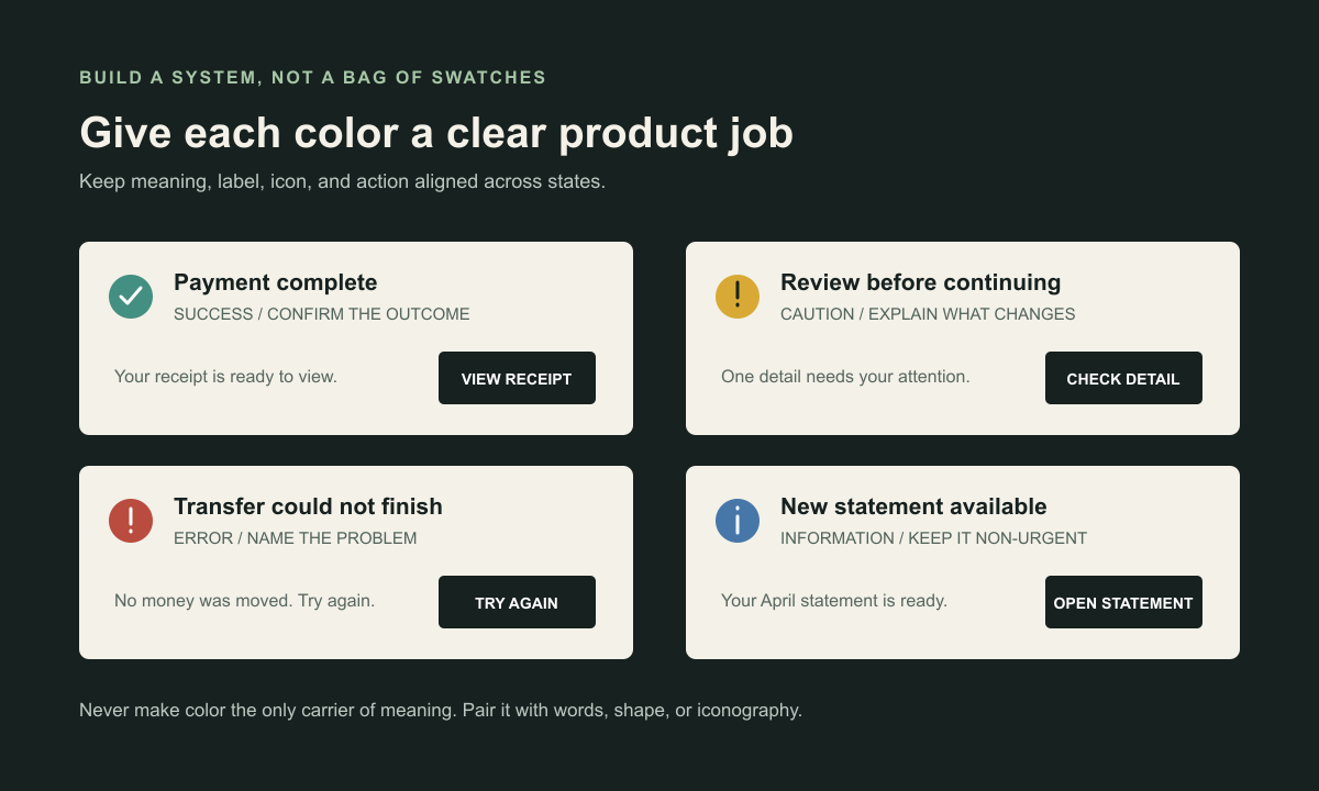
Status color helps people scan a dense screen quickly. It is also easy to misuse. If every notification is bright, people stop distinguishing urgent failures from routine updates. If success appears before an action is complete, the interface breaks trust.
Pair each state with a plain-language label and a next step. A completed payment might use a calm success color, a check icon, “Payment complete,” and a receipt action. An error should identify what failed, explain what remains safe, and offer a repair path. A warning should say what could change and how to review it.
- Use success for a confirmed outcome, not an action still in progress.
- Use caution when a decision is genuinely needed, and explain why.
- Use error for a real failure, with recovery wherever possible.
- Use informational styling for updates that do not need alarm.
- Keep status meaning stable across pages, devices, charts, and notifications.
Make the System Accessible
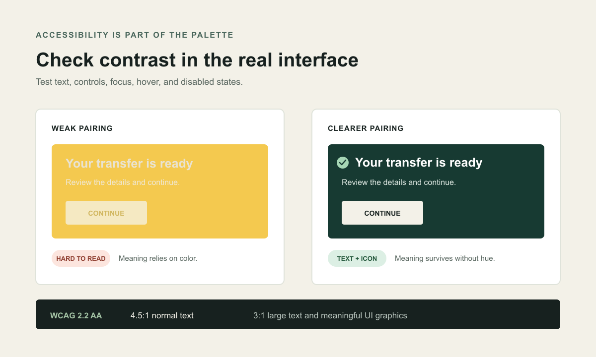
A useful palette must work across different vision, devices, environments, and ways of interacting. Color must never be the only way to identify an error, selected option, required field, chart series, or successful action. Pair it with text, shape, iconography, position, or a clear pattern.
Check contrast in context. WCAG 2.2 AA requires at least 4.5:1 for normal text and 3:1 for large text. Meaningful graphical objects and interface components generally need 3:1 against adjacent colors. Verify the rendered component: transparency, overlays, gradients, and state changes can alter the effective pair.
Do not stop at the default state. Test hover, keyboard focus, pressed, selected, disabled, error, and validation states. Confirm focus remains visible and text remains legible at zoom and on small screens. Automated checks help, but they do not replace a keyboard pass or task test with people.
Account for Culture, Context, and Theme
A product may serve people with different cultural references, category expectations, and familiarity. Even within one audience, the same shade can feel playful in shopping and alarming in a financial workflow. Ask people how they interpret the actual screen instead of asking them to assign abstract emotions to isolated swatches.
Dark and light themes also change color roles. A hue that works as a bright background may need a different lightness as text. Define theme-aware semantic tokens, keep controls legible, and avoid simply inverting every value. Check charts, focus rings, and elevation alongside the main interface.
Personalization deserves care. Do not infer sensitive traits or emotional states from color preference. Make theme choices understandable and reversible, and preserve contrast and status meaning in every option.
Research and Test Color Choices
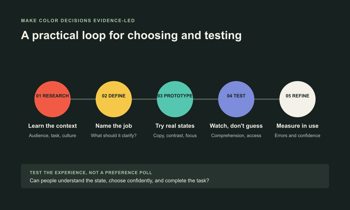
A preference poll can tell you which option someone likes in a moment. It cannot prove that the color makes a task clearer, reduces mistakes, or improves trust. Test a realistic screen and measure what people understand and do.
- Start with an observation: note where people overlook an action, misread a status, or hesitate.
- Write a hypothesis: for example, “A persistent selected-state treatment will distinguish chosen filters from available filters.”
- Change one meaningful variable: keep task, wording, and layout stable enough to interpret the result.
- Test representative use: include different devices, display conditions, and color-vision needs.
- Combine evidence: observe task completion and errors, ask what the state meant, and check contrast and focus.
A/B tests can help when traffic and outcomes are clear, but can reward short-term clicks while obscuring confusion or exclusion. Pair behavior with task quality and qualitative feedback.
Measure Whether Color Is Working
Color has no single success metric. Choose signals that match the product job and evaluate them alongside accessibility and task quality.
- Discoverability: can people find the primary action without searching?
- Comprehension: can they explain a status, selection, or chart?
- Decision quality: do they choose for the right reason, not just click the brightest control?
- Error and recovery: do cues prevent mistakes and help people get back on track?
- Inclusive completion: can people using different displays, vision, and input methods finish?
- Consistency: is the same status recognized across journeys and themes?
Compare against a baseline and investigate unexpected differences. More clicks are not a win if people are less certain about what they agreed to.
A Practical Color-Design Workflow
Bring design, product, engineering, content, and accessibility perspectives together early. A short, repeatable process prevents color from being decided at the last minute and makes the system easier to maintain.
- Map product states and the decisions people need to make.
- Audit existing colors, including charts, alerts, and legacy screens.
- Define role-based tokens and document purpose and constraints.
- Prototype actual components in light and dark themes and interaction states.
- Check contrast, keyboard focus, non-color cues, and responsive behavior.
- Test a real task; record comprehension, errors, and confidence.
- Ship a focused improvement, monitor it, and update documentation.
The outcome should be a shared design language, not a frozen palette. A well-named system makes future improvements safer to apply.
Color System Checklist
- Does every color have a clear, documented product role?
- Are associations treated as hypotheses grounded in audience and task?
- Can users understand actions and states without color alone?
- Have text, icons, controls, and focus indicators been checked in context?
- Are success, warning, error, and information states used consistently?
- Do themes preserve hierarchy, contrast, and semantic meaning?
- Have charts been checked for distinguishable data series?
- Does research measure comprehension and outcomes, not preference alone?
- Can people recover from an error and understand what happens next?
Color Should Make the Product Easier to Read
Color psychology is most useful when it makes a product decision more thoughtful. It helps teams ask what people should notice, what a state means, and whether a cue is clear to the people who need it.
Start with context. Give colors stable roles. Pair them with words and structure, verify contrast, and test real tasks. When color supports comprehension instead of competing for attention, the whole product becomes easier to use. Talk with Webx Design Studio about building a clearer digital product.
Frequently asked questions
Does a color always have the same psychological meaning?
No. Associations vary across people, cultures, categories, and situations. Treat color meanings as hypotheses to research with the people and context your product serves.
How many colors should a digital product use?
There is no universal number. Start with a restrained set of brand and neutral colors, then add semantic roles only when they clarify a distinct state or action. Define and document each role.
Can color alone communicate an error or success?
It should not. Pair color with a clear label, icon or shape, and a useful next action so the state remains understandable when color perception differs.
What contrast ratio should product teams target?
WCAG 2.2 AA calls for at least 4.5:1 for normal text and 3:1 for large text. Meaningful interface components and graphical objects generally need 3:1 against adjacent colors. Check actual rendered states, not only palette swatches.