

Every page asks people to spend attention. The question is whether the page rewards it with a clear next step—or makes them hunt through equally loud messages, cards, buttons and labels.
Visual hierarchy is how a layout answers that question. It gives information an order: first the promise, then the evidence, then the action. Done well, it feels effortless rather than persuasive.
Visual Hierarchy Is the Order in Which a Page Gets Understood
People do not read a website from top left to bottom right in a perfectly orderly way. They scan for relevance. Their eyes look for the largest idea, the sharpest contrast, familiar shapes, faces, and anything that appears to promise a useful outcome.
Hierarchy helps you arrange those signals so they support one another. It is not about making every important thing bigger. It is about making the most important thing easiest to notice at the moment it matters.
Attention Follows a Path, Not a Checklist
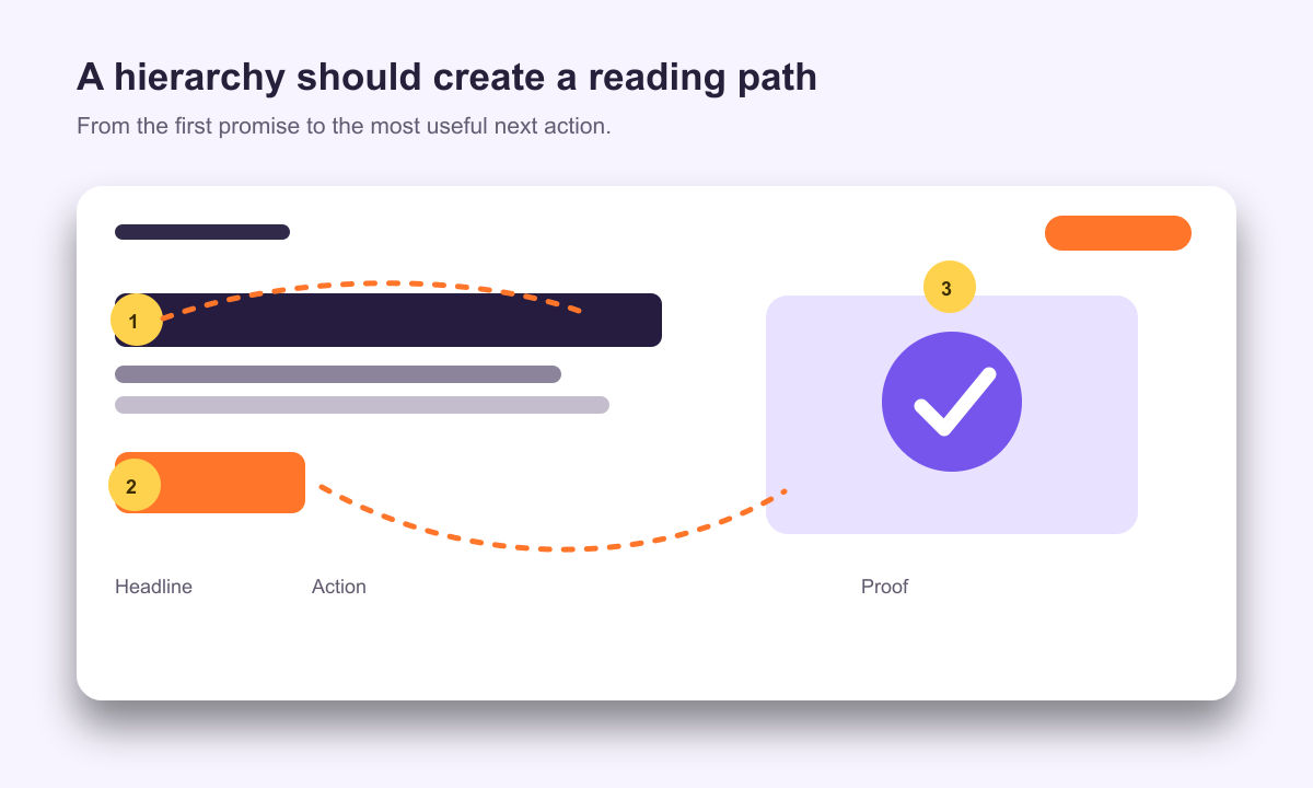
A good page has a sequence. The headline earns the first glance. Supporting copy answers the obvious question. Proof reduces doubt. A call to action offers a next step. Visitors can skip around, but the visual weight still gives them a reliable way back into the story.
When every block competes at the same volume, visitors must create that sequence for themselves. That takes effort, and effort often becomes hesitation.
The Signals That Create Emphasis
Hierarchy is rarely created by one property alone. A button becomes easier to find when it has contrast, enough room around it, a clear label, and no neighbouring control with the same visual strength. A headline becomes memorable when its size, position and message work together.
- Size and scale: larger elements attract attention first, but a single oversized element can make supporting content feel disconnected.
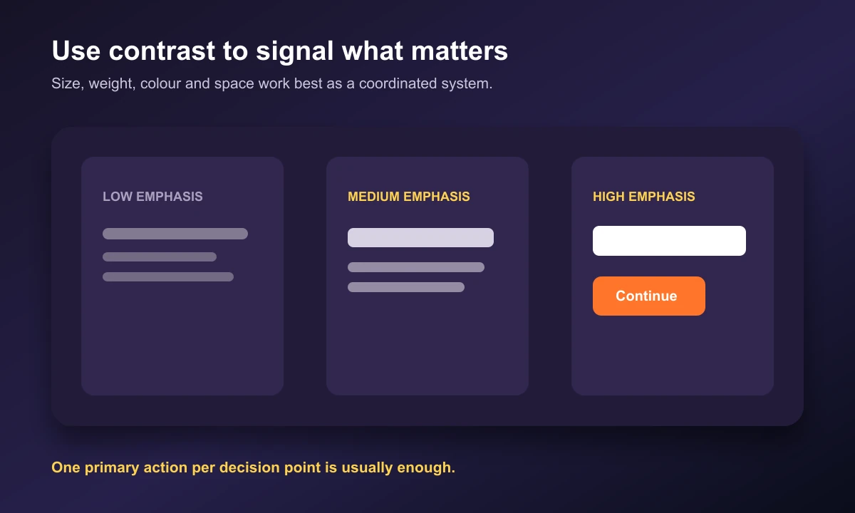
- Contrast: a change in colour, lightness, weight or shape creates a clear signal. Reserve the strongest contrast for the most valuable moment.
- Position: people notice elements near the start of a reading path and near natural stopping points in a layout.
- Space: an element with room around it feels more important because it has fewer competitors.
- Repetition: consistent components teach visitors what is primary, secondary and optional across the entire site.
Build the Page Around Decisions, Not Decorations
Start with the decision you want a visitor to make on that page. It might be to understand a service, compare plans, request a proposal, or add an item to a cart. Then design the content in the order someone needs to see it to make that decision with confidence.
- Write the one sentence a visitor should remember after a quick scan.
- Place the clearest proof directly after or alongside that message.
- Give the primary action a distinct visual neighbourhood.
- Demote links and options that are useful but not needed for this decision.
- Test the layout with realistic content, not short placeholder copy.
This approach often removes more than it adds. The strongest hierarchy usually comes from reducing competing signals, not stacking on another badge, gradient or animation.
Give the Primary Action a Clear Role
A prominent CTA is not simply a bright button. It is the natural conclusion to the information immediately before it. Its label should describe the outcome, its surrounding copy should resolve the last question, and nearby links should not compete for the same level of urgency.
For example, a service page can use “Book a discovery call” as the primary action and keep “View case studies” as a quieter supporting path. Both are useful, but they do not deserve the same amount of visual emphasis at the same time.
On Mobile, Hierarchy Has Nowhere to Hide
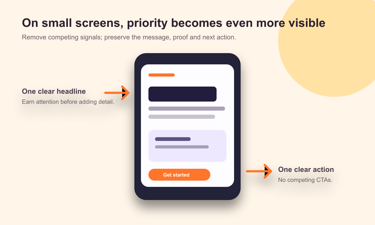
Desktop layouts can use columns and generous space to show several ideas at once. On a small screen, content becomes a single vertical sequence. That makes weak priorities obvious: a busy header, repeated buttons, oversized labels and long introductions can push the real point below the fold.
Review mobile as its own experience. Put the most useful content first, keep controls comfortably sized, reduce decorative interruptions, and ensure that every CTA still makes sense with only the surrounding content visible.
A five-minute visual hierarchy audit
- Squint at the page. Do the dominant shapes still reveal the headline and main action?
- Remove the colour. If the interface becomes grayscale, can people still see what is primary?
- Read only headings and buttons. Do they tell a coherent story and lead to meaningful choices?
- Check one section at a time. Is there a single element with the strongest emphasis?
- Open it on a phone. Is the first screen still clear before someone scrolls?
Common Mistakes That Flatten a Layout
- Making every button primary: identical bright CTAs force visitors to choose before they understand the page.
- Using too many type sizes: a scale with too many steps creates noise rather than meaningful contrast.
- Treating every block as a card: repeated borders, shadows and backgrounds give low-priority detail the same weight as the main story.
- Relying on colour alone: use scale, weight, labels and space too, so priority survives varied screens and accessibility needs.
- Ignoring the content: hierarchy designed with two-line placeholder cards often fails when real titles and descriptions arrive.
Design for the Next Useful Glance
Visual hierarchy is not a styling pass at the end of a project. It is a way to respect attention from the first wireframe onward. Each choice about space, type, imagery and contrast tells people what deserves their focus.
Begin with a single page and make its purpose visible in three seconds. Once that decision is clear, use hierarchy to turn every extra detail into support—not competition.
Frequently asked questions
What is visual hierarchy in UX design?
It is the intentional ordering of interface elements so people notice the most important message, supporting information and next action in a useful sequence.
What creates visual hierarchy on a website?
Size, contrast, colour, position, spacing, type weight, imagery and motion can all create hierarchy. The strongest layouts use only a few of these signals at a time.
Can visual hierarchy improve conversion?
Yes. A clearer value proposition, relevant proof and an easy-to-find next action reduce decision friction and help visitors move forward with confidence.