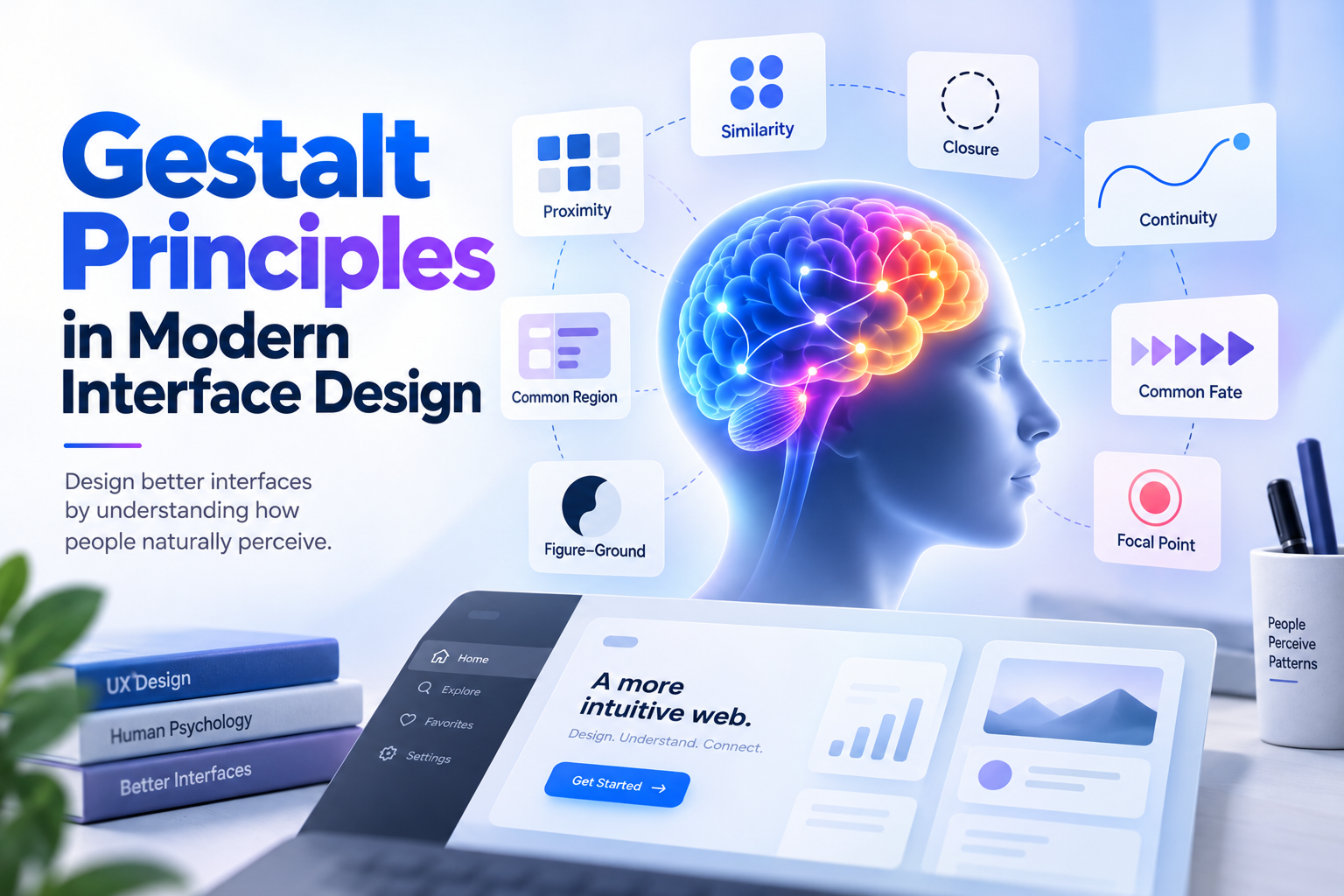


A modern interface can contain excellent components and still feel confusing. The problem is often not the individual button, card, or illustration. It is the relationship between them.
Gestalt principles give designers a practical language for those relationships. They explain how people group information, notice contrast, complete patterns, and follow visual paths before they consciously read every word.
What Gestalt Means for Interface Design
Gestalt psychology is built around a simple observation: people perceive organised wholes, not isolated visual fragments. In a product interface, that means spacing, alignment, colour, shape, and order all communicate before copy does.
These principles are not decoration rules. They help users answer useful questions quickly: what belongs together, what can I click, what is most important, and where does this flow continue?

1. Proximity: Space Tells Users What Belongs Together
Elements placed close together are usually read as a group. A form label near its input feels connected; a heading with tight supporting text feels like one content unit. When unrelated items share the same spacing, the interface becomes harder to scan.
- Keep labels visually closer to the controls they describe.
- Use larger gaps between sections than between items inside a section.
- Give a card enough internal rhythm that its content reads as one object.
- Check mobile layouts separately because narrow screens amplify spacing mistakes.

2. Similarity: Shared Appearance Signals Shared Function
When controls share colour, shape, typography, or behaviour, people expect them to have a related role. A design system depends on this principle: primary actions should look like primary actions wherever they appear.
Similarity is powerful, so use it deliberately. If every element is highlighted, nothing has priority. Reserve strong emphasis for actions and states that genuinely deserve attention.
3. Figure-Ground: Make the Important Layer Stand Out
Figure-ground helps people separate the thing they need to act on from its surroundings. Contrast, scale, whitespace, and surface treatment can bring a dialog, task, or key result forward without turning the entire screen into noise.
This is especially important in dashboards and AI-assisted workflows. Users need to know what is active, what is background context, and what will change if they continue.

4. Common Region: A Boundary Creates Belonging
A background, border, or container can signal that several elements belong to the same task. Common region is useful for filters, billing summaries, settings groups, and multi-step panels where the relationship needs to remain clear even when the content is dense.
Use containers to explain structure, not to decorate every sentence. Too many nested surfaces flatten the hierarchy and make the user work harder to find the main action.
5. Continuity: Lead the Eye Through a Flow
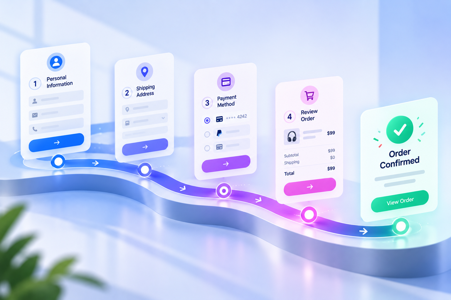
People tend to follow aligned edges, lines, sequences, and directional cues. Consistent columns, step indicators, connected navigation, and progressive disclosure all use continuity to make the next move feel natural.
- Align related content along a shared edge.
- Use a clear visual order for multi-step tasks.
- Keep repeated navigation in a stable location.
- Let transitions preserve the relationship between a previous and next state.
6. Closure: Let People Complete the Pattern
Closure describes our tendency to perceive a complete shape even when part of it is missing. In UI, subtle cues can help people understand a carousel, progress indicator, cropped card, or icon without adding extra explanation.
Closure should support recognition, never hide essential information. Do not crop labels, obscure critical actions, or rely on a clever visual where a plain explanation is safer.
7. Focal Point: Use Emphasis with Intent
A strong contrast, unusual shape, bright accent, or isolated element attracts attention. Focal points help users find the primary action and understand the intended starting point, especially on a busy screen.
A useful test is to blur the page or squint at it. If the eye jumps between several equally loud areas, simplify the emphasis before adding more copy.
8. Common Fate and Shared Motion: Show What Changes Together
Elements that move in the same direction or change at the same time are perceived as related. This can make filtering, sorting, drag-and-drop, and responsive transitions easier to understand.
Motion should remain purposeful and accessible. Keep it short, preserve context, and respect reduced-motion preferences. The goal is to explain a relationship, not to perform a visual trick.
Turn Gestalt Principles into Design-System Rules
The most useful way to apply Gestalt is to translate it into repeatable decisions your team can inspect. Document spacing relationships, surface levels, emphasis tokens, alignment rules, and responsive behaviour alongside components.
- Define spacing tokens for label-to-control, item-to-item, and section-to-section relationships.
- Document which colours mean action, selection, status, and decoration.
- Use component anatomy to keep headings, descriptions, controls, and feedback connected.
- Review empty, loading, error, and success states with the same visual principles.
- Test the system on real content instead of only tidy placeholder text.
A Practical Gestalt Audit for Any Screen
Before shipping a page, ask five quick questions:
- Can I tell which elements belong together without reading every word?
- Do elements that look similar behave similarly?
- Is the primary task visually distinct from background context?
- Does alignment guide the eye toward the next useful step?
- Does the interface still make sense with real content, zoom, and smaller screens?
Pair this visual audit with usability testing and accessibility checks. Gestalt principles explain likely perception, but real users reveal whether the experience actually supports their goals.
Final Thoughts
Gestalt principles remain relevant because modern interfaces still ask people to interpret relationships. Whether the product is a mobile app, an analytics dashboard, or an AI workflow, clarity comes from making structure visible.
Start with proximity and similarity, strengthen figure-ground and continuity, then inspect the quieter details such as closure, focal points, and shared motion. The result is not just a better-looking interface. It is a product people can understand with less hesitation.