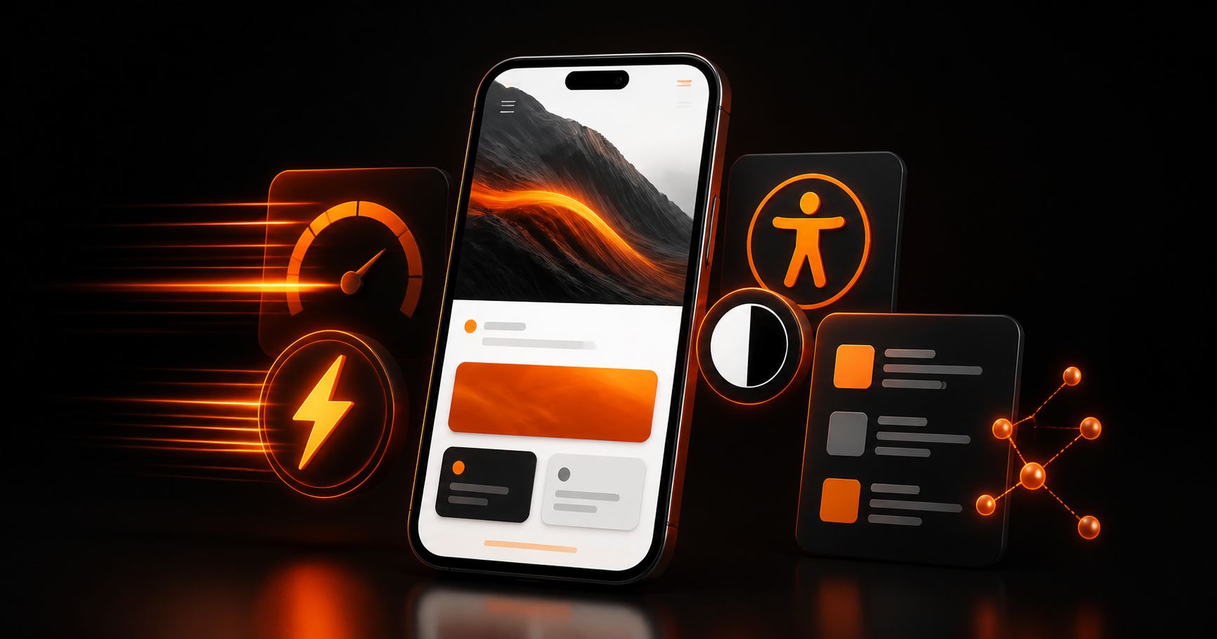


A great website in 2026 does more than look polished. It gives people a clear path on any screen, responds quickly, welcomes every visitor, and makes its meaning easy for search engines and AI assistants to understand.
The strongest sites are built around four connected priorities: mobile-first design, performance, accessibility, and clear, structured content.
Use this guide as a practical checklist when you are launching a new site or deciding what to improve on an existing one.
1. Start mobile-first, not mobile-last
Begin with the smallest screen so each page has a clear hierarchy, readable type, thumb-friendly actions, and no unnecessary friction.
- Light mode advantage: Higher legibility for long-form reading and dense content.
- Dark mode advantage: Reduced glare in low-light environments and a stronger sense of focus.
- Light mode risk: Can feel harsh on dark screens and may increase eye strain in dim conditions.
- Dark mode risk: Poor contrast can make small text hard to read, especially for users with low vision.
2. Make speed part of the experience
Visitors judge a site before they read it. Fast loading, responsive interaction, and stable layouts build trust; delays make even beautiful design feel unreliable.
- Media and entertainment apps: Video players, music apps, and creative tools often feel more immersive in dark mode.
- Nighttime use cases: Apps designed for evening reading, gaming, or sleepy conditions benefit from lower brightness.
- High-contrast dashboards: Interfaces with charts, graphs, or status indicators can reduce visual noise with dark backgrounds.
- Brand mood and premium feel: Dark mode can communicate luxury, mystery, or a technology-forward brand tone.
3. Build accessibility into every decision
Accessibility is not a final compliance pass. It improves clarity and usability for everyone, including people using keyboards, screen readers, zoom, or a poor network connection.
- Reading and learning experiences: Articles, documentation, and educational content are typically easier to consume in light mode.
- Professional productivity tools: Spreadsheets, forms, and enterprise apps often benefit from clear visual hierarchy in light themes.
- Accessibility for diverse audiences: Light mode generally supports consistent contrast ratios across different devices and user settings.
- Daytime environments: When users are in bright settings, light mode feels more natural and legible.
4. Use semantic structure that AI can understand
Clear HTML gives browsers, assistive technology, search engines, and AI systems dependable context. Use one descriptive H1, logical H2 sections, semantic lists, labels, and structured data that matches the visible page.
Dark mode best practice: Avoid pure black backgrounds for body text areas; use dark grey tones and ensure text remains at least 4.5:1 contrast against the background.
Light mode best practice: Avoid pure white backgrounds when possible; soft off-whites reduce glare while preserving contrast.
- Use accessible text colors for all body copy, labels, and form text.
- Maintain clear focus styles for keyboard navigation in both themes.
- Ensure interactive elements have strong contrast from their background states.
- Test with actual users who have vision differences and low-light sensitivity.
5. Write for humans first, then make it machine-readable
Write direct answers to real customer questions. Use descriptive headings, concise paragraphs, helpful examples, and original expertise so a visitor or an AI assistant can accurately understand and cite your content.
- Keep layouts consistent across themes; avoid reorganizing content purely because the background changed.
- Use accent colors intentionally — brighter accents on dark backgrounds, richer neutrals on light backgrounds.
- Maintain a clear visual hierarchy with card shadows, borders, and separators that adapt to each mode.
- Use subtle depth and layering (not just flat color) to help users distinguish interactive areas.
6. Give every page a focused job
A strong page has one obvious next step. Whether it is requesting a quote, booking a call, purchasing, or reading a guide, remove competing actions and explain the value of progressing.
- Know your audience: Professional users and knowledge workers often prefer light mode during the day; creative and media audiences often prefer dark mode.
- Consider the environment: If users spend time in low-light or evening settings, dark mode can reduce discomfort.
- Use system preferences: Honor the user's OS-level theme if you support both modes, and provide a manual override.
- Measure engagement: Compare metrics like session length, time on page, and task completion for users in each mode.
7. Measure the experience continuously
Great websites are maintained, not simply launched. Track real-user performance, accessibility regressions, search visibility, and conversion behaviour, then use evidence to guide the next improvement.
- Test both themes with users in real environments: daylight, office lighting, and low-light situations.
- Measure task success across common flows such as reading, form entry, and navigation.
- Observe whether users switch themes or leave the page when the default mode feels wrong.
- Collect qualitative feedback to understand whether your interface feels calm, clear, and trustworthy.
Final takeaway: useful, fast and inclusive wins
Dark mode and light mode are both valid choices. The right decision is not about which one looks cooler — it is about which one supports your users, content, and context most effectively.
For many products, the best outcome is a polished light mode as the default with an optional dark theme for users who prefer low-light or immersive experiences. For others, dark mode can be the star feature when it reinforces the brand and the primary use case.
Design both themes with the same care, test them with real users, and keep readability, contrast, and comfort at the center of every decision.