

A SaaS landing page is a collection of assumptions about what a visitor needs to understand, believe, and do next. A/B testing is how you replace those assumptions with evidence.
The strongest experiments do not chase cosmetic wins. They clarify value, reduce perceived risk, and help the right visitor make a confident decision. Use this guide as an experimentation backlog for better SaaS landing-page design.
Start With a Hypothesis, Not a Hunch
Write each experiment as a sentence you can disprove: “For this audience, changing X will improve Y because Z.” X is the design or message, Y is the primary outcome, and Z is the insight behind the idea. Choose one primary metric—qualified demo starts, trial activations, or completed checkout—and add guardrails such as activation quality and page speed.

- Test one decision at a time: avoid mixing a new hero, form, pricing model, and audience in one experiment.
- Segment with intent: paid-search visitors, referrals, and returning users may need different evidence.
- Log every outcome: a neutral result still tells you which levers matter less than expected.
17 A/B Testing Ideas for SaaS Landing Pages
1. Value proposition framing. Compare an outcome-led promise (“Close your month faster”) with a capability-led one (“Automated reconciliation”). The winning message makes the intended customer feel immediately understood.
2. Audience-specific heroes. Give each role or industry a hero that mirrors its job-to-be-done. The same product can solve a finance leader’s and an operations manager’s problem differently.
3. The job of the hero visual. Test a product UI, a short product-in-use clip, and an explanatory diagram. A visual should reduce uncertainty, not simply decorate the page.
4. One CTA versus two paths. Compare a direct “Start free” action with a low-commitment secondary action such as “Watch the 90-second tour.” Measure whether the second path assists qualified conversion or creates a detour.
5. Specific CTA copy. Replace generic labels with the concrete value exchange: “Build my first dashboard,” “See the platform in action,” or “Get the migration plan.”
6. Perceived form effort. Try progressive capture: email first, qualifying questions later. Compare completion with lead quality, not completion alone.
Make the First Screen Earn the Scroll
Above the fold is where visitors decide whether the page deserves more attention. Test a coherent strategy: message, proof, CTA, and visual should answer the same “why now?” question.
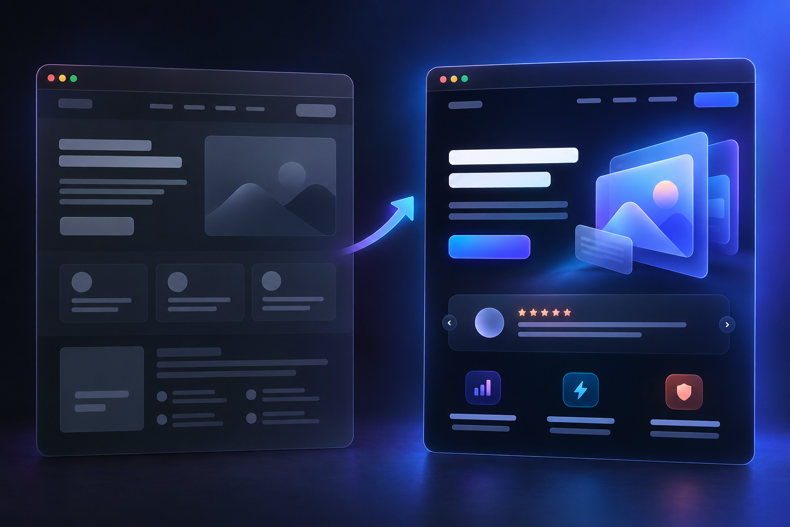
7. Social-proof placement. Test customer logos, review signals, or a concise result beside the CTA, below the hero, and after the product explanation. Match proof to the purchase anxiety: credibility, security, scale, or time-to-value.
8. Benefit order. Place the benefit that answers the visitor’s largest anxiety first. New categories often need problem-and-outcome; known categories may need differentiation.
9. Navigation restraint. A dedicated campaign page may benefit from fewer exits, while high-consideration visitors may need product, security, or customer-story links. Navigation is a trust decision, not a fixed rule.
10. Friction-removing microcopy. Test a relevant reassurance under the CTA: “No credit card,” “Replies within one business day,” “SOC 2 documentation available,” or “Cancel anytime.”
Test the Proof and Decision Support Below the Fold
11. Customer stories versus feature grids. Some visitors need to see what the product does; others need to see who succeeded with it. Compare a compact before-and-after story with a conventional features section.
12. “How it works” formats. Test a three-step sequence, interactive tour, or annotated screenshot. Choose the smallest format that makes adoption feel manageable.
13. Pricing context. Test a starting-price anchor for price-sensitive audiences against a value-first path for complex enterprise consideration.
14. Risk reversal. A trial, pilot, migration support, implementation guarantee, or clear cancellation policy can move a decision more than another feature bullet.
15. Comparison content. For switchers, test a clear “built for teams that have outgrown…” section. Focus on accurate decision criteria, not competitor baiting.
Mobile, Speed, and the Last Mile
Do not assume a desktop winner will win on a small screen. Mobile visitors scan differently, tap differently, and are less tolerant of a slow or confusing path.

16. Mobile CTA behavior. Compare an inline action with a sticky bottom CTA, keeping the label and destination the same. Check completed action, not only taps.
17. Speed of understanding and speed of the page. Test a simplified hero: fewer motion effects, lighter media, or a video preview. Confirm that the message remains clear as the page becomes faster.
Prioritize What Can Change the Decision
Score ideas by reach, potential impact, and confidence in the underlying insight. Value proposition, offer structure, proof, pricing context, and form strategy normally outrank tiny visual tweaks. Keep a decision log with the hypothesis, audience, treatment, metric, guardrails, result, and next question—this is what makes learning compound.
Read Results Like a Product Team
A temporary lift is not automatically a lasting win. Run long enough to represent usual traffic patterns, avoid declaring victory from a handful of conversions, and check that a winner does not harm a meaningful guardrail. The most useful conclusion is a reusable customer insight, not a percentage in isolation.
Final Thought: Every Test Should Make the Page More Honest
The best SaaS landing pages do not pressure people into a click. They make the product, payoff, and next step easier to understand. Start with the message and the moments of doubt; test a meaningful alternative; then keep what your customers’ behavior genuinely supports.
Need a landing page built around evidence rather than guesswork? Webx Design Studio combines UX design, conversion strategy, and clear product storytelling. Talk to our team about your SaaS landing page.